A New Logo and Custom Web Design for Talos InfoSec
Another website created by FirmDesign has gone live! The cyber security consulting firm, Talos InfoSec, has launched their site and is ready for ...
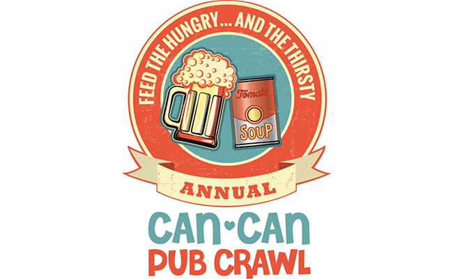
Harmony, consistency, and visual impact are key when it comes to good design. Our president here at Firm, Mark Gammill, did an excellent job utilizing these key components when designing the logo for the Can-Can Pub Crawl. He created a simple style and flow using complementary colors in a clean crest design. It was so excellent in fact that it won Customer Design of the Week from Rush Order Tees. Here’s what Rush’s design expert judges said about why they chose our design:
“I ended up choosing the Can-Can Pub Crawl design because of the harmonious colors and the overall clean, simple crest design. The design utilizes cohesive clipart and fonts, all of which are properly weighted within the design. That makes for a great-looking t-shirt.” -Colton
“I selected the Can-Can Pub Crawl Design because it is simply a strong, cohesive design. It was clever, well thought out, aesthetically pleasing, and has an excellent color scheme.” -Brian
This is my favorite compliment from another judge, Joe:
“It’s almost as if this t-shirt was channeling Andy Warhol himself. It’s vibrant and whimsical, but still portrays a very clear and concise message. Its use of a muted triadic color scheme helps the design jump right off the cloth and into your heart, giving it an almost three-dimensional effect. It is a well-rounded design that begs you to look at it up and down, left and right. The design makes sure you take in all the information being presented. Very well done. Cheers!”
That’s the kind of impact that a logo ought to have! We are so happy that our clients with the Can Can Pub Crawl contribute to a great cause and chose us for their logo design. Contact us today for award-winning logo design for your organization!